Well for the purposes of understanding this, you don’t need to. This post is stupid for so many other reasons. Like any graph your axis have to make sense. You’re plotting two pieces of data against each other so you need to know what those two pieces of data are and what their scales are.
But here they’re measuring IQ against political leanings. But that doesn’t work because political affiliation isn’t a scale any more then favourite colour is a scale. IQ is a scale, but the bottom axis is just nothing.
Fun fact, the findings were actually that the students thought they scored closer to the average than they actually did. As in, below average students did think they scored higher, but they still thought they scored below average.


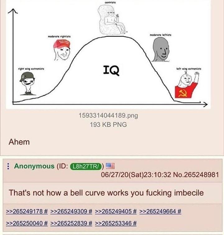
It is how someone with severe Dunning-Kruger thinks a Bell curve works, though.
Hey, they are in the top 99% of IQ scores.
I have a BA in performing arts and a MA in film, I have no idea what a Bell curve does.
Acknowledging that limitation means my previous statement doesn’t apply to you.
Well for the purposes of understanding this, you don’t need to. This post is stupid for so many other reasons. Like any graph your axis have to make sense. You’re plotting two pieces of data against each other so you need to know what those two pieces of data are and what their scales are.
But here they’re measuring IQ against political leanings. But that doesn’t work because political affiliation isn’t a scale any more then favourite colour is a scale. IQ is a scale, but the bottom axis is just nothing.
That’s a comment from someone who thinks the Dunning-Kruger effect is real and not the result of applying statistics wrongly
Fun fact, the findings were actually that the students thought they scored closer to the average than they actually did. As in, below average students did think they scored higher, but they still thought they scored below average.
Ah yes, as if regression to the mean is not a statistical phenomenon